60-30-20 Decor Visualizer
Design Your Palette
Select your three colors to see how they balance according to the 60-30-20 rule.
Visual Result
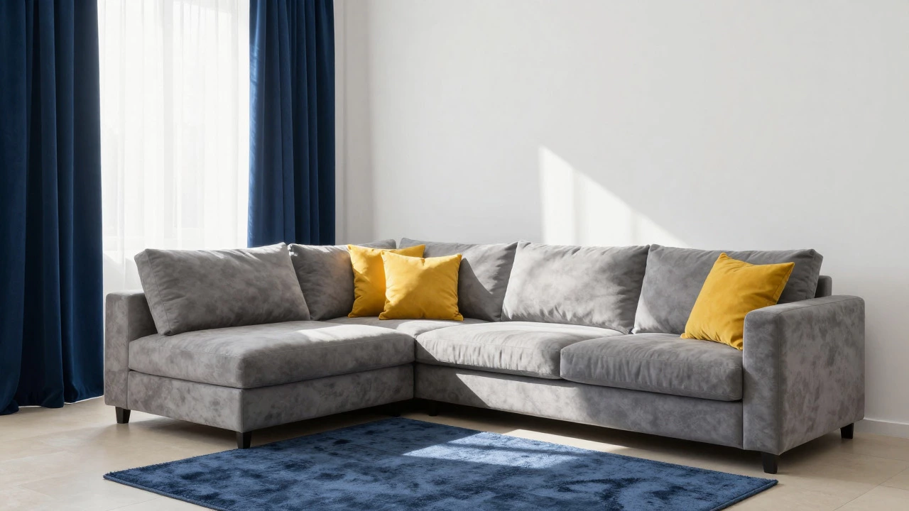
The room is anchored by a light neutral base (walls/large furniture). Depth is added through medium tone elements like curtains or rugs. Finally, pops of vibrant color provide focal points via cushions and accessories.
Ever walked into a room that felt just... off? Maybe the colors clash, or it feels too busy, or perhaps it’s just boring. You’ve probably tried rearranging furniture or swapping out throw pillows, but something still doesn’t click. That’s where the 60-30-20 rule comes in. It’s not magic, but it is a reliable framework that designers have used for decades to create balanced, visually pleasing spaces. And if you’re working with cushions-whether you’re restyling a living room sofa or refreshing a bedroom chair-this rule is your best friend.
The 60-30-20 rule breaks down your color palette into three parts: 60% dominant color, 30% secondary color, and 20% accent color. Sounds simple, right? But applying it correctly takes a bit of nuance, especially when you’re mixing textures, patterns, and materials. Let’s walk through how this works in practice, why it matters, and how you can use it to transform your space without spending a fortune.
Understanding the 60-30-20 Rule
The 60-30-20 rule is an interior design principle that divides a room's color scheme into three proportions: 60% dominant, 30% secondary, and 20% accent. This approach ensures visual harmony by preventing any single color from overwhelming the space while still allowing for personality and contrast.
Think of it like cooking. If you add too much salt (accent), the dish becomes inedible. Too little, and it’s bland. The 60-30-20 ratio keeps everything in balance. In decorating, the 60% is usually your walls, large rugs, or main furniture pieces. The 30% might be upholstery, curtains, or area rugs. The 20%? That’s where cushions, artwork, and small accessories come in.
Why does this work? Because our eyes are drawn to contrast and variety, but we also crave order. When you follow this rule, you give your brain enough stimulation to stay interested without causing visual fatigue. It’s the difference between a well-composed photograph and a cluttered snapshot.
How to Apply the 60-30-20 Rule with Cushions
Cushions are one of the easiest ways to experiment with the 60-30-20 rule because they’re inexpensive, interchangeable, and highly visible. Here’s how to break it down:
- 60% Dominant Color: This is your base. If your sofa is gray, your walls are white, and your rug is beige, those make up the majority of what you see. Your cushions should complement this, not fight it. Stick to neutral tones or shades within the same family as your dominant color.
- 30% Secondary Color: This adds depth. Maybe your curtains are navy blue, or you have a wooden coffee table with warm undertones. Use cushions in this color to tie the room together. For example, if your secondary color is teal, choose two or three cushions in varying shades of teal.
- 20% Accent Color: This is where you get playful. Bright yellow, burnt orange, or even metallic gold can pop against more subdued backgrounds. Limit yourself to one or two cushions in this color so it doesn’t overpower the space.
Let’s say you have a cream-colored sectional, light wood floors, and white walls. Your 60% is covered. Now, you want to introduce some character. You could add four cushions in soft sage green (your 30%) and two bold mustard-yellow ones (your 20%). Instantly, the room feels curated instead of random.
Choosing Colors That Work Together
Picking the right combination of colors isn’t guesswork-it’s strategy. Start by identifying the mood you want to create. Calm and serene? Go for cool tones like blues, greens, and grays. Energetic and vibrant? Try warm hues like reds, oranges, and yellows. Neutral and sophisticated? Stick to blacks, whites, taupes, and charcoals.
Once you’ve decided on a direction, look at existing elements in the room. What colors are already present? Can you pull inspiration from them? For instance, if there’s a painting with hints of coral and turquoise, use those as your secondary and accent colors. This creates cohesion across different layers of the room.
If you’re stuck, lean toward nature. Look outside your window. Notice how flowers often have a dominant petal color, surrounded by complementary shades. Mimic that structure indoors. Nature rarely makes mistakes when it comes to color combinations.
Working With Patterns and Textures
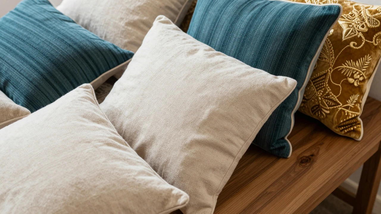
Color alone won’t save a dull room. Texture plays an equally important role in making a space feel inviting. Mixing fabrics like velvet, linen, wool, and cotton adds dimension and interest. Even if all your cushions share similar colors, varying their textures will keep things dynamic.
Patterns complicate things slightly, but they don’t have to derail your plan. Follow these guidelines:
- Keep patterned cushions limited to the 30% or 20% categories. Solid colors should dominate the 60% section.
- Choose patterns that incorporate your chosen color palette rather than introducing new ones entirely.
- Vary scale-mix large geometric prints with smaller floral motifs to avoid monotony.
Imagine a setup where most cushions are solid ivory (60%), interspersed with striped navy-blue ones (30%), and finished off with a couple of embroidered gold-patterned pieces (20%). Each layer contributes uniquely without competing for attention.
Common Mistakes to Avoid
Even seasoned decorators slip up sometimes. Here are frequent pitfalls to watch out for:
- Ignoring lighting conditions: Natural light changes how colors appear throughout the day. Test samples under both morning sun and evening lamps before committing.
- Overloading accents: More isn’t always better. Three bright cushions might look great initially, but after weeks, they’ll start feeling chaotic.
- Mixing unrelated styles: Bohemian throws paired with minimalist leather sofas create dissonance unless carefully balanced.
- Neglecting proportion: Remember, 60% means roughly two-thirds of visible surfaces. Don’t let tiny details overshadow bigger commitments.
Avoiding these errors saves time, money, and frustration. Plus, it helps maintain consistency across multiple rooms if you’re redesigning an entire home.
Real-Life Examples
To bring this concept fully alive, consider real-world scenarios:
| Room Type | Dominant (60%) | Secondary (30%) | Accent (20%) |
|---|---|---|---|
| Living Room | Gray Sofa + White Walls | Blue Curtains + Rug | Mustard Yellow Cushions |
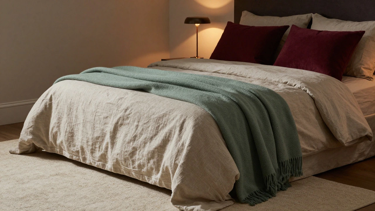
| Bedroom | Beige Bedding + Carpet | Green Throw Blanket | Burgundy Pillow Covers |
| Dining Area | Wooden Table + Chairs | Black Metal Lampshade | Red Napkin Rings |
In each case, notice how the largest visual components anchor the space while smaller touches inject personality. These setups prove that following the 60-30-20 rule leads to professional-looking results without requiring expert training.
Tips for Beginners
New to decorating? No problem. Start small. Pick one corner of your home and apply the rule there first. Swap out old cushions, adjust placement, and observe how the shift affects perception. Gradually expand outward once comfortable.
Also, invest in quality over quantity. Cheap synthetic fibers wear quickly and lose vibrancy faster. Opt for durable materials like cotton blends or performance fabrics designed specifically for high-use areas.
Finally, don’t hesitate to seek feedback. Show photos to friends or post online communities dedicated to interior design. Fresh perspectives catch issues you might overlook due to familiarity.
Advanced Techniques
For those ready to level up, try incorporating seasonal variations. Change accent colors based on holidays or weather shifts. Summer calls for lighter pastels; winter invites deeper jewel tones. Rotating selections keeps interiors fresh year-round.
You can also play with gradients. Instead of distinct blocks of color, blend transitions smoothly. Imagine moving from pale lavender to rich purple across adjacent cushions. Subtle shifts evoke sophistication without abrupt contrasts.
Another advanced tactic involves integrating personal artifacts. Display meaningful objects alongside coordinated textiles. A vintage map framed beside earth-toned pillows tells a story beyond mere aesthetics.
Frequently Asked Questions
Can I use the 60-30-20 rule for black-and-white schemes?
Absolutely! Black-and-white fits perfectly into the framework. Treat white as your 60%, gray as 30%, and black as 20%. Alternatively, reverse roles depending on desired emphasis. Monochromatic palettes rely heavily on texture differentiation since hue variation is minimal.
Does the 60-30-20 rule apply to outdoor spaces?
Yes, though environmental factors influence choices differently outdoors. Consider natural surroundings when selecting dominant colors. Plants provide built-in greenery, reducing need for artificial representation. Weather-resistant materials ensure longevity regardless of exposure levels.
How many cushions should I place on a standard couch?
Typically three to five per seat width works best. Arrange asymmetrically for casual vibes or symmetrically for formal settings. Ensure spacing allows easy movement without obstruction. Adjust numbers according to individual comfort preferences.
Are there exceptions to the 60-30-20 rule?
Certainly! Art galleries sometimes deviate intentionally to highlight specific exhibits. Similarly, themed parties may prioritize festive decorations over traditional balance. However, everyday living benefits greatly from adhering closely to established principles.
Where can I find affordable yet stylish cushion options?
Check local thrift stores, online marketplaces like Etsy, or discount retailers offering designer knockoffs. Seasonal sales frequently feature markdowns exceeding fifty percent. DIY projects using leftover fabric scraps offer cost-effective alternatives too.
Should I match cushion colors exactly with other furnishings?
Not necessarily. Exact matches risk appearing dated or overly rigid. Aim instead for harmonious relationships among neighboring hues. Slight discrepancies add intrigue while maintaining overall unity. Think coordination rather than replication.
Is it okay to mix modern and traditional styles using this method?
Definitely! Combining eras yields eclectic charm provided execution remains thoughtful. Balance sleek contemporary lines with ornate classical details via strategic distribution across percentages. Result reflects intentional eclecticism rather than accidental mismatch.
How do I know which color serves as my dominant shade?
Identify whichever occupies greatest surface area visually. Usually walls, flooring, or primary seating qualify automatically. Once determined, build remaining selections around foundational choice ensuring seamless integration throughout environment.
Mar 8 2025

Dec 19 2025